Color Therapy In Home Décor
Colors have always been a source of inspiration and comfort to me. In elementary school, I participated in the Young Author’s Program and wrote a children’s book called “Rainbow Colors.” Ever since then I have sought to surround myself with colors that stimulate positive feelings and create a peaceful environment. In fact, one of the key reasons that I have focused on flower photography is to capture all the beautiful colors found in nature. Not only are colors lovely to behold, but research has also found that they provide important health benefits. One of the easiest ways to achieve these benefits is to choose the right colors for your home décor. Below is a brief description of the history of color therapy, along with modern practical application. Following is a recommendation of three colors that will enhance your living space featuring selected images from this site.
Since ancient times, civilizations have recognized the importance of color to daily life. People are naturally rejuvenated by the warm hues of sunlight and calmed by the cool shades of night. This is directly related to the production of serotonin and melatonin by the brain’s pineal gland. If there is an imbalance in these hormones (as often occurs in winter when there is less daylight), health problems may occur. Ancient Egyptians and Greeks believed that the colors contained in sunlight reflected the divine and influenced various aspects of life. Consequently, they developed treatments using specific colors, including painting rooms in shades beneficial for healing. Color therapy continued in the Middle Ages and Renaissance, especially through the medical treatises of Avicenna and Paracelsus.
From the nineteenth century to the present, modern research methods have confirmed ancient wisdom in color healing. Studies have been conducted to determine how colored light affects blood pressure, arthritis, and depression, among many other ailments. One condition affecting several million people that can benefit from color therapy is seasonal affective disorder (SAD). This results from an increase in melatonin levels due to decreased sunlight in winter. It is more prevalent in northern areas, especially those with prolonged rainy and overcast weather. I experienced this condition myself when I lived in the Pacific Northwest. While exposure to sunlight is the best cure, that is often not possible in such climates. In this situation, surrounding yourself with bright colors may be beneficial. Research has shown that the brain responds not only to sunlight but also to specific colors, which signal the endocrine system to regulate hormones.
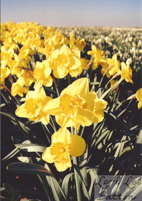
One of the best colors to ease the winter doldrums and lift your spirits is yellow. This color represents sunlight and the renewal of the earth in spring. Daffodils are among the first flowers to bloom in February or March and are a sign that spring is at hand. After a long gray winter, I remember how rejuvenated I felt while walking through a field of bright yellow daffodils in Oregon’s Willamette Valley. I took the photo shown above called “Golden Daffodils” to keep a reminder of the promise of spring year-round. Yellow can be used throughout your home, but is particularly effective in family rooms or areas where children play or study because it stimulates the intellect and promotes joy. For those interested in incorporating Feng Shui in home decor, it is important to note that yellow is considered to be the central element. As in Western tradition, yellow is believed to represent the earth and facilitate good health. By hanging a picture such as “Golden Daffodils” in a central area of your home, you will be able to harness the positive energy of yellow in accordance with Eastern and Western design principles.
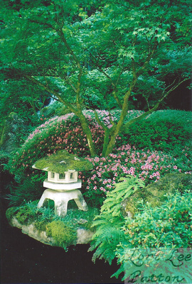
Another color useful in achieving a peaceful and relaxed home environment is green. As it is adjacent to yellow on the color wheel, green is a harmonious partner in creating a balanced color scheme. Like yellow, green also represents springtime through its association with plants and fertility. In addition, it symbolizes luck and good fortune: in Western culture as it relates to Irish shamrocks, leprechauns, and four-leaf clovers; and in Eastern tradition where it embodies the powerful green dragon. In decorating terms, green is a receding color, which means that it makes a room appear larger. It is an excellent color to use in small spaces and has been shown to alleviate feelings of claustrophobia. Green is also the easiest color for the eye to see since no retinal adjustment is needed to focus on it. Incidentally, this is the reason that traffic lights are green for passing through intersections and change to red to indicate a stop. As green also aids mental recall and concentration, it is ideally suited for home offices or studies. The above photograph “Lush Japanese Garden” is a lovely way to include green in your wall décor. I took this picture at the height of spring and it features many shades of green found in the maple leaves, ferns, moss, and other vegetation. The pink azaleas provide a pleasing accent color.
Besides green, the other neighbor to yellow on the color wheel is orange. Since it works in harmony with yellow, orange provides many of the same benefits, such as stimulating joy and bringing warmth into your home. However, as orange is created from yellow and red, it contains additional attributes. Orange offers energy and vitality represented by the fire element in Feng Shui, but is often more suitable than red in home décor because it is not as overpowering. Orange is associated with creativity in Eastern and Western traditions. Therefore, it is a great companion to yellow for use in children’s playrooms or other areas within your home that are devoted to artistic pursuits, such as crafting or sewing. For me the greatest representation of orange in nature is the California poppy found throughout the west coast region. I took the photograph “California Poppy Field” shown above at the state reserve located in the Antelope Valley. During a short time in early spring, the usually brown hillsides are transformed into spectacular, orange fields reminiscent of Oz. By placing this image of bright poppies in your home, especially a foyer, you can create a welcoming and cheerful atmosphere for all who enter.
Color therapy in home décor is an easy, effective way to use a holistic healing method that has been practiced since ancient times. Cheerful, stimulating colors, such as yellow and orange, balanced with the calming hues of green are an excellent way to get started! After experimenting with these, you may want to branch out to the contrasting colors of red, blue, and purple. Soon you will create a home environment with all the colors of the rainbow sure to enhance your life throughout every season!
Sources
Dee, Jonathan, and Lesley Taylor. Beginner’s Guide to Color Therapy. New York: Sterling, 2003.
Graham, Helen. Discover Color Therapy. Berkeley: Ulysses Press, 1998.


